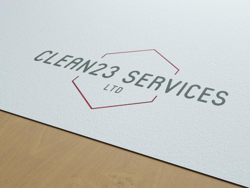
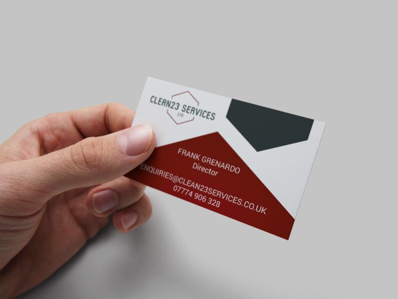
Clean23 Services Ltd Branding and Stationery
Discussing their branding with Clean23 Services Ltd, they wanted to appear professional and step away from a traditional cleaning symbolism. The reason for choosing the number 23 in the company name was that there are 23 chromosomes in the human body, and the company really want to express their quality cleaning - you could say cleaning is in their DNA!
We explored the use of subtle shapes to represent structures, and strong professional colour palettes that create an impact to fit into the corporate world.
We also created the website for Clean23 Services, read more here.
View Project OnlinePlease note: Any websites under client control may look different than displayed, due to updates over time.